October 2008

You are currently browsing the monthly archive for October 2008.

Death Maps

From the Guardian:

The geographical pattern of mortality in Great Britain over the past quarter century has been mapped for the first time, revealing how each of us is most likely to die depending on where we live. The Grim Reaper’s Road Map: An Atlas of Mortality in Britain shows exactly how people’s deaths are affected by where they live, how much money they have, the type of work they do and their lifestyle. [more…]

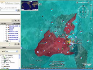
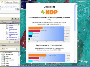
This is really interesting way to look at the election results.  Cédric, developed this excellent interactive Elections 2008 Mashup which uses the GeoGratis.ca Electoral Boundary file and the Elections Canada CSV data files of the results for the 38th, 39th and 40th elections and validated some of the data with information from Parliament of Canada Website.   He used Google Earth and Google Charts and associated code as his tools and shares the how to here.

While I do not find Google Earth maps pretty, I do like the flight angles, I love watching how the scale shifts as the earth moves from globe, to Canada, Québec, Montreal and then to the riding.  I really enjoy seeing the information pop up on the landscape and the satelitte imagerie in the background.  Cédric also used some nice cartographic techniques by shading electoral district colours to the proportion of the vote for the winning party.  At a glance it looks like he selected a lighter colour if the vote was less than 50% and a more sure solid colour when the vote is more than 50%.  I also aesthetically appreciated having the ridings transparent allowing the viewer to see the air photo/satellite images of the city and connecting the political process with a physical or tangible reality in the background.  I was impressed that uncertainty was visually represented on the electoral terrain.  It is notoriously difficult on a map to reveal multiple voices, and choropleth maps in particular are tricky as the polygon of a uniform colour deceives the reader into seeing/thinking/imagining the bounded social and physical terrain/phenomenon as being uniform.

Cédric SAM

Cédric SAM Election Mashup

Cédric SAM

Cédric SAM Election Mashup

Cédric Sam Election Mashup

Cédric Sam Election Mashup

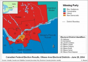
Glenn Brauen was able to use audio on his maps of the 39th election to feature uncertainty, complexity and multiplicity.  On his maps the proportion of the vote determined the audio levels of a speech read by the leader of each party. These audio files were then combined and attached to the electoral district.  As the users scrolls over the district multiple voices are heard, you may hear a clear and distinct leader’s voice and the others lower in the background, or in cases where the vote was very close you hear competing voices or cacophonie making ovious that red/blue/orange or light blue does not necessarily imply a clear win nor uniformity.  It was a really innovative way to show multiplicity.  He also used interesting open source technologies to create these: Scalable Vector Graphics (SVG) (W3 standard for web graphics), Java, and Adobe as well as NunaliitGlenn like Cédric shares his methodology, and graciously distributes his work on a CC license.

Glenn Brauen, Web mapping with sound using SVG

Glenn Brauen, Web mapping with sound using SVG

I was looking for maps all night on the Tele!  None appeared so I came home and found a few.   I wonder if the cost and license restrictions of the actual electoral boundary file was an issue for television networks and the media.  The only institution that provided a map with ridings was CBC. The rest were visualizations or shell maps of provinces and territories.

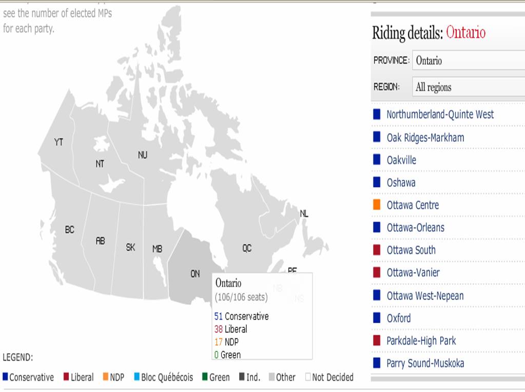
The CBC maps were interactive, with roll overs pop ups and some zooming capabilities!  As I predicted before seeing the maps, multicoloured areas are urban, west is blue with some patches of orange, centre is orange, east is baby blue, with some patches of red and blue, and all those country ridings are tory blue!  And Ottawa, which I did not predict, is surrounded by blue, with one orange and 2 reds!  Ontario, well, it is awfully blue!  Kinda fun to look around to see what is up!

CyberPresse has a pretty interesting visualization!  One cannot see the real geographic distribution of the results but it remains a creative and interactive way to see the votes!  As you scroll over the little squares a pop up window shows the results!  At a glance a user can see the number of seats per province and then look at the littles squares and their colours, this was perhaps a little less effective but I guess they were struggling with screen real estate and access to a base map.

CTV had a pretty rudimentary map of the provinces and territories.  If you click on the province you get a window of the ridings and a rather garish obtrusive list of ridings that blocks the map.  You select the riding and then you get the results of the province in a table but not a geographic distribution of results by riding.  The map is then left at the bottom of the page all lonely with not much information associated with it.
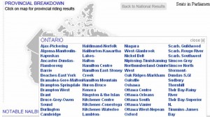
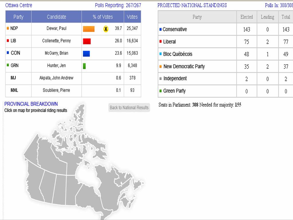
The Globe and Mail also had an interactive map but again just a shell with the provinces and territories like CTV example above, with a small bit of scroll over action that yields a pop up window and the left pane changing on the right.  Informative but not the big picture of the country like a map with all the ridings.
Finally there is our national institution, Elections Canada!  A few minutes ago it had no results! Oh My!  No maps, and not the most intersting way to access the info. I wonder if they will ever produce a map?  Will it be more than a static PDF? Since they own the base file you’d think they could do a little something with that monopoly access?  Or perhaps because Statistics Canada sells that for them they also have some sort of dissemination restrictions.

From Jon Udell:

Recent legislative drama highlights the absurdity of expecting people to make sense of complex texts that are evolving rapidly in high-stakes, high-pressure situations. What we have here is a classic culture clash, in this case between people who think in terms of paper documents and those who think in terms of electronic documents.

Washington is a paper-based culture. There are hopeful signs of change, and Bob Glushko spotted one of them here:

Based on the file name embedded in the pdf of the bill — O:\AYO\AYO08C04.xml — at least the people doing the publishing work for the bill are doing their best to save our tax dollars by creating the file using XML for efficient production and revision.

But there’s no public access to AYO08C04.xml. The government’s reflex is still to publish paper, or its electronic equivalent, PDF. So when the Sunlight Foundation’s John Wonderlich tried to visualize the evolution of the Senate’s version of the bailout bill, he was reduced to printing out PDFs, arranging them on the floor, and marking them up with a yellow highlighter. [more…]