 It is very odd that national health organizations are not reporting COVID-19 cases aggregated into health regions even though provinces and territories are mostly reporting them in that way. And where is the national health framework datasets?
Framework data are a “set of continuous and fully integrated geospatial data that provide context and reference information for the country. Framework data are expected to be widely used and generally applicable, either underpinning or enabling geospatial applications” P.7.
Federal Electoral Districts for example, are the official framework data for Elections Canada and these data are updated for each election. They are used to administer elections, report the results of exit polls during the elections, and show the results after an election. Framework data are available in multiple formats as well as in cartographic or mapping products for Geographic Information Systems (GIS) such as ESRI, MapInfo or Tableau (Shapefiles), in KML formats for GoogleMaps, and in standardized online mapping GML Formats which also happens to also be a Treasury Board Secretariat of Standard for Geospatial Data. Election result data are aggregated into these framework data along with other socio-economic data, and once these data are mapped we can compare and can tell a more nuanced local, regional and national story, we can see patterns across the country. The benefit of framework data are many, what is also great is they are created once by an authoritative source, they are updated and reliable, they are used many times, they are open data and everyone knows where to get them.
Considering that health care spending is one of the largest expenditures we have as a nation state, and it would be expected that in an era of accountability and transparency and where outcomes based management is the norm, it is astonishing that health data including its social determinants data are not disseminated in this way. Yes, there are privacy issues, but we are capable of addressing those with the Census and Elections, which means we can also do so for health. We need to have an evidence based conversation about population health now more than ever, and we will need these data to tell a socio-economic story as well. Could we have done better? Who is doing great and why and who is not doing so great and why, what can we learn and what is the remedy?
Numerous useful and insightful interactive maps were published after the elections (CBC, CTV, Macleans, ESRI and many others), and these generated much discussion, people could see the results, they could situate themselves, they could see what friends and family in other places were experiencing. Analysts and policy makers also had what they needed to understand and plan a new context. This is what democratic evidence based data journalism and policy making is all aboutt!
Natural Resources Canada is normally the producer of Canada’s framework data but it does not produce a health region framework dataset for Canada. Arguably, these data would not only be useful during a pandemic, but also for administering and reporting health associated with natural resources such as allergies in the spring and fall, food insecurity, health and farming, or health after a natural disaster such as flooding and fires. They data would also be useful to see where money is spent providing Canadians with the evidence they require to advocate for change.
So why no national heath reporting by their administrative boundaries and where is the health region framework dataset?
National Health Reporting Canada:
Virihealth.com and ESRI Canada produced the the first National ge0-COVID-19 reporting:
- In March 2020, an anonymous individual voluntarily compiled daily reports from Official Provincial and Territorial health authorities and published these on a WordPress site called Virihealth.com Canada’s Coronavirus COVID-19 Tracker . These were the original datasets used by ESRI Canada.
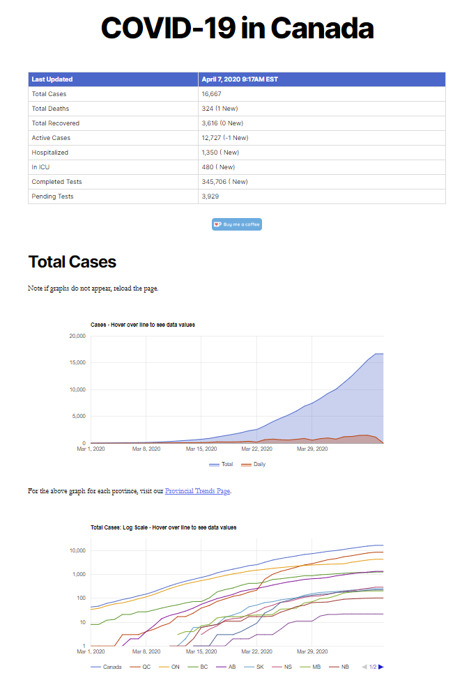
https://virihealth.com/
- National COVID-19 data were reported by ESRI Canada a private mapping software company. They produced a Health Tracker, an Outbreak Tracker and numerous COVID-19 data Resources. They also shared health geography GIS files for some Provinces and Territories and the Statistics Canada Health region. They started doing so in March of 2020 and they taught others how to also do so.
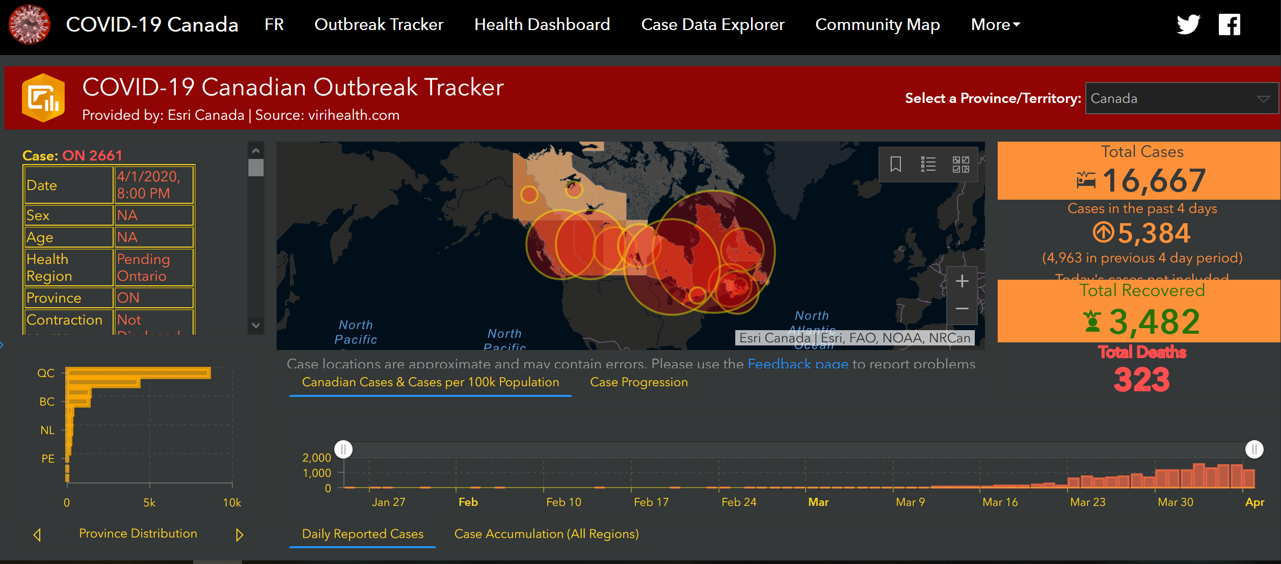
https://resources-covid19canada.hub.arcgis.com/app/eb0ec6ffdb654e71ab3c758726c55b68
- At the University of Toronto on April 1, a group students and researchers began compiling data into an open data and open source site called Epidemiological Data from the COVID-19 Outbreak in Canada. Their process is explained in GitHub and they publish tabulated data in a Google spreadsheet by Province and Territory .
Federal Government:
Canada as a federation has jurisdictional divisions of power, and one of those jurisdictional divides is health. We have the Canada Health Care Act (CHA) that
“establishes criteria and conditions related to insured health services and extended health care services that the provinces and territories must fulfill to receive the full federal cash contribution under the Canada Health Transfer (CHT)”.
The Canada Health Transfer (CHT) provides long-term predictable funding for health care, on a per capital basis and
“supports the principles of the Canada Health Act which are: universality; comprehensiveness; portability; accessibility; and, public administration”.
The provinces and territories receive cash transfers to deliver health care to Canadians and health care data reporting is done by the each province and territory separately. This alone justifies the creation of a national health region framework dataset. Which organization should be responsible for it?
There are three main organizations which are part of the Canada Health Portfolio that currently report official COVID-19 cases. At the moment, they do not publish COVID-19 case data by health regions.
Health Canada “is the Federal department responsible for helping Canadians maintain and improve their health, while respecting individual choices and circumstances.” Health Canada is an official and authoritative national source of COVID-19 data and it publishes the Coronavirus disease (COVID-19): Outbreak update. Reporting includes an interactive map and a line graph of data by Province and Territory.
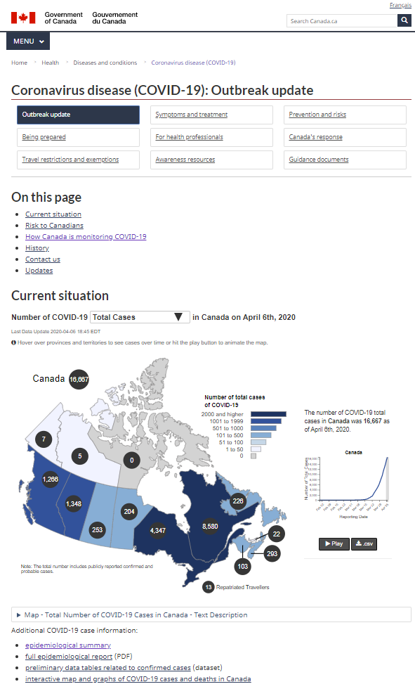
https://www.canada.ca/en/public-health/services/diseases/2019-novel-coronavirus-infection.html
Public Health Agency of Canada (PHAC) promotes and protects the health of Canadians through leadership, partnership, innovation and action in public health and it does so by: Promoting health; Preventing and controlling chronic diseases and injuries; Preventing and controlling infectious diseases; Preparing for and responding to public health emergencies; Serving as a central point for sharing Canada’s expertise with the rest of the world; Applying international research and development to Canada’s public health programs; and Strengthening intergovernmental collaboration on public health and facilitate national approaches to public health policy and planning. PHAC now disseminates an excellent interactive dashboard entitled the National Epidemiological Summary of COVID-19 Cases in Canada. Their data sources are: Public Health Agency of Canada, Surveillance and Risk Assessment, Epidemiology update; Natural Resources Canada – Grey basemap with Credit: COVID-19 Situational Awareness tiger team Powered by ESRI-Canada and COVID-19 Canadian Geostatistical Platform, a collaboration between Public Health Agency of Canada, Statistics Canada and Natural Resources Canada.
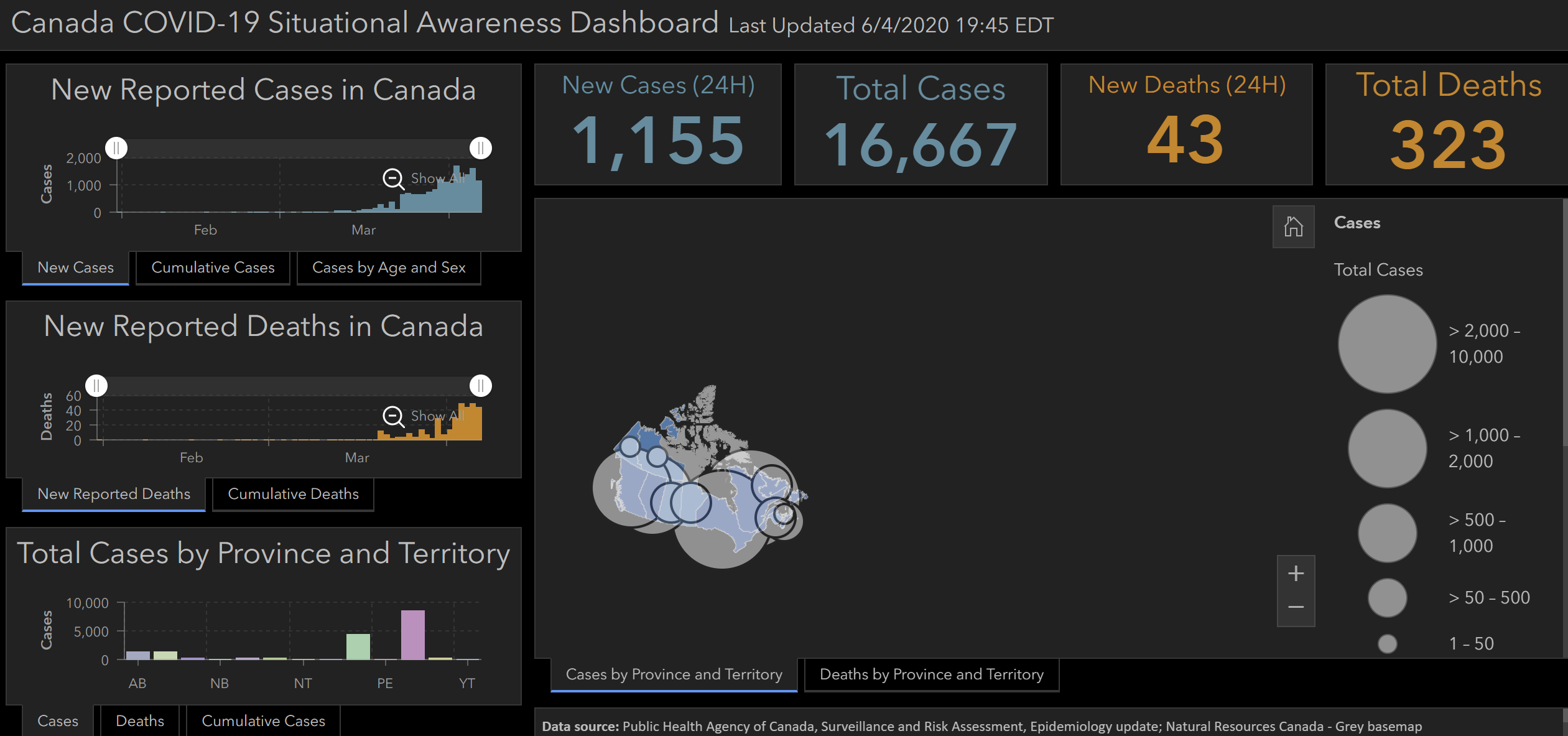
https://phac-aspc.maps.arcgis.com/apps/opsdashboard/index.html#/e968bf79f4694b5ab290205e05cfcda6
Canadian Institute for Health Research (CIHR) is the Government of Canada’s health research investment agency and its mandate is to “excel, according to internationally accepted standards of scientific excellence, in the creation of new knowledge and its translation into improved health for Canadians, more effective health services and products and a strengthened Canadian health care system.” Although a research funding organization, CIHR could publish a national framework dataset of health units to help researchers in Canada and to also to disseminate the findings of research either about COVID-19 or any other research according to those administrative boundaries. (Update 07/04/2020 CIHR does not have a framework data file)
A national non-governmental organization, the Canadian Institute for Health Information (CIHI) also disseminates national comparative health data, mostly about the administration of health and it would make sense for them to also publish data by health units and to have such a framework dataset. CIHI is an independent, not-for-profit organization that provides essential information on Canada’s health system and the health of Canadians. (Update 07/04/2020 CIHI does not have a framework data file). CIHI’s mandate is
“to deliver comparable and actionable information to accelerate improvements in health care, health system performance and population health across the continuum of care”.
Natural Resources Canada is the producer of most of Canada’s Framework data, and it could with the help of the Canadian Council on Geomatics Provincial and Territorial Accord could create this framework file and this was discussed at the 4th Annual SDI Summit meetings hosted in Quebec City in the Fall of 2019.
Statistics Canada produces Provincial and Territorial Health Geographies and it does seem to have a national GIS Health Regions: Boundaries and Correspondence with Census Geography file for 2018, and if that is the case, why are health geographies not reported by these boundaries? (Update 07/04/2020 StatCan has a 2018 GIS national health geography file). Here is a PDF version of the 2018 map.
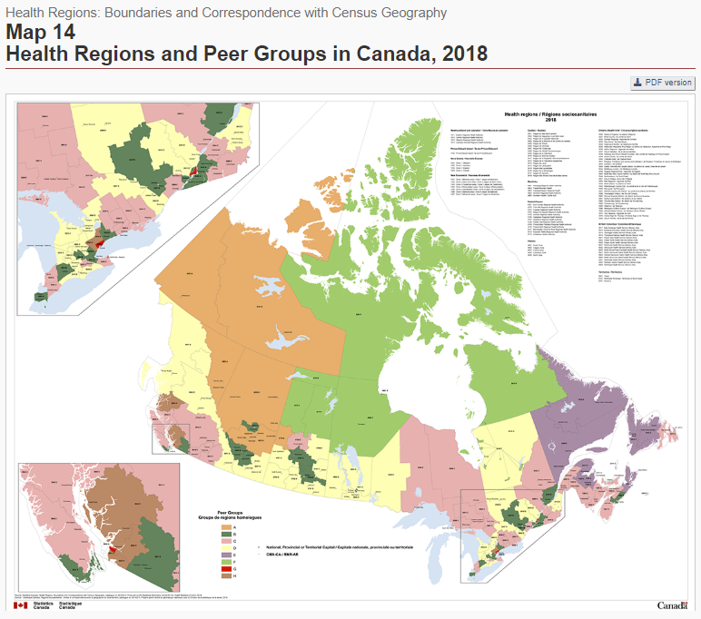
https://www150.statcan.gc.ca/n1/pub/82-402-x/2018001/maps-cartes/rm-cr14-eng.htm
Provincial and Territorial Official COVID-19 Case Reports and health geographies:
Below I have compiled a list of official COVID-19 Case reporting by province and territory, and when I could find them, I included a link to health administration geographies. That does not mean that data are reported in maps, but data are generally tabulated according to health administration geographies.
Alberta
- Health, Disease prevention and surveillance, produces COVID-19 Stats Alberta
- Here is a Description of Official Standard Geographic Areas
British Columbia
- The Provincial Health Services Authority, BC Centre for Disease Control
- BC Health Boundaries
Manitoba (Updated RHA and Map info. 07/04/2020)
- COVID-19 Updates
- Manitoba’s Regional Health Areas boundaries are legislatively defined and are described in the RHA Establishment Regulation.
- RHA Manitoba Boundaries are available as .GIF, .DOC, .DXF, .SHP and .KMZ formats.
Newfoundland and Labrador (Updated RHA and Map info. 07/04/2020)
- COVID-19 Pandemic Update Data Hub
- The Regional Health Authorities geographies are explained in this news release.
- I was emailed RHA shape files and here is a PDF copy of the 4 health regions.
New Brunswick (Updated RHA and Map info. 07/04/2020)
- Office of the Chief Medical Officer of Health (Public Health) Coronavirus data
- COVID-19 Case Map
- NB has two regional health authorities (RHAs) as explained in their Health Act and has, in addition to the RHA structure, seven health regions for purposes of the Act.
- NB Health Region maps are available for free in as FDGB, Shape and LPK formats, and as a PDF reference map.
North West Territories
Nova Scotia
- Novel coronavirus (COVID-19)
- Novel coronavirus (COVID-19) cases in Nova Scotia data visualization
- Nova Scotia Health Authority Management Zones
Nunavut
Ontario
Prince Edward Island (Updated Health PEI info. 07/04/2020)
- PEI COVID-19 Testing Data
- PEI has one health authority, Health PEI which has the responsibility for providing health services across PEI. There are no health regions.
Quebec (Updated Map info 08/04/2020)
- Ministère de la Santé et des Services sociaux Coronavirus (COVID-19)
- Fichier cartographique des limites territoriales des régions sociosanitaires (RSS)
- Informations concernant les limites territoriales : des réseaux locaux de services (RLS), des centres locaux de services communautaires (CLSC), des réseaux territoriaux de services (RTS), des régions sociosanitaires (RSS) et les réseaux universitaires intégrés de santé (RUIS)
Saskatchewan
- Cases and Risk of COVID-19 in Saskatchewan Reports in tables and map
- Saskatchewan Health Region Map See p.8
- Health Region Health Network Map
Yukon (Updated Health Region info. 07/04/2020)
- Health and Wellness COVID-19
- Yukon does publishing data by Health Region.
I have emailed each of the Provincial and Territorial governments to confirm that I have the latest heath geography framework data. I have received updates from Yukon, Quebec, PEI, New Brunswick, and Manitoba, and have updated map data accordingly. I have also received correspondence from Statistics Canada, and CIHI.
For the moment ESRI Canada and some of the Provinces and Territories are reporting Official COVID-19 Cases by health region geographies. Why aren’t Health Canada and the Public Health Agency of Canada doing so? And where is the National Health Region Framework Data file?


Comments on Posts